Monday, March 31, 2014

Image Re-Creation

This was the image I chose to re-create. It was originally designed by Mike Sudal of The Wall Street Journal. This picture was found on google images and is pretty pixelated, but you get the idea of what it is. 


Here is my version of the illustration. I tried to use the eyedropper to accurately choose the original colors used, but since it was pixelated, the program had a hard time detecting the original color so I kind of had to eyeball it. Otherwise, I think it's pretty close. 

Sunday, March 23, 2014

Travel Poster Process

This was my final choice on the direction of my poster. Since the name of the town is Lake City, it's kind of mandatory to show a lake ;) 


I began by tracing the actual lake, which was the easiest part. The color is 40% of Pantone 285 C. 

Then I traced the mountains. After I traced the mountains, they looked boring so I started adding trees and shading to add something to them. I also noticed there wasn't really a distinct separation between the bottom of the mountains and the water, so I added a drop shadow to the mountains. Now it looks like there's a little bit of depth between the two. 
Then came the tricky part, the trees! It took me a while to find a brush that wasn't too blobby or jagged. I used a pretty simple brush for the pine trees, but I used a grunge brush for the large one in the foreground. I also wanted to distinguish the colors between the big tree and the background trees, so I multiplied the colors and made the foreground tree darker. The darker green is 100% Pantone 177-16 C and the lighter one is 75%. This screenshot also shows the added sky. I tried adding clouds, but nothing compared to the clouds in the original photo, they just looked fake and took away from what I was trying to convey in the picture. The color of the sky is 75% Pantone 285 C. 


And finally, I added the text. Lake City is written in a font called "Respective" retrieved from fontspace.com. Colorado is written in Baskerville. I like how the letters in Lake City overlap Colorado. This poster was pretty tricky, but it was a lot of fun getting to stare at my favorite place for a while :) can't wait to go back next year!


Monday, March 3, 2014

Travel Poster

My travel poster will be based off my favorite place in the world...Lake City, Colorado! This place is our annual family vacation spot. My concept will be based off these pictures (which I took myself in 2013 while we were on vacation). More than anything, I want to incorporate the scenery. But if I can, I'd like to include the friendly wildlife as well. 


Here are my stitches based on the pictures I posted. Each one accurately represents Lake City. I want to use block letters for the font because that is the type that is used on the sign when you drive into town. I'm excited to design something that supports such a beautiful place!


I took this picture last year in Lake City. I really like this type choice and would like to use it in my travel poster. The font is pretty just like the town! I believe it is "Respective" font from fontspace.com

I found this color palette on http://www.bkrdsn.com/alaska/ and I think it represents the colors used in the photos above. Specifically, I will be using the colors brown, green, and blue with different shades of each one. 

Saturday, February 22, 2014

Jackie Robinson Layout


Here are the sketches I made for my layout. I found a layout on Pinterest that I really liked that actually had text inside a baseball. Since this layout is definitely baseball-related, I thought it was perfect for my concept. The headline for my layout is "Jackie Breaks Through" insinuating that he broke through the barriers of race in major league baseball years ago. 


However, I had some issues with the baseball text. It's in the shape of a baseball, but it wouldn't let me apply an outer stroke to the shape. It would only apply it to the text, making it thicker and I didn't like that. Also, I couldn't figure out how to apply negative space within the baseball. I could use assistance on that :)


Here is the most I've gotten out of my layout. Since I couldn't figure out the stroke/negative space issue, I did it in block text. I also couldn't figure out how to fade off the bricks instead of them just stopping. I added the quote by Jackie Robinson because it relates to the freedom he achieved during his time as a professional baseball player. My typographical choices were pretty simple. I wanted a simple, classy text to surround the "broken" text to make it stand out. The simple text is in Baskerville and the word "BREAKS" is a font that I downloaded from fontspace.com called cracked and bold. Overall, I think it's pretty cool! This was a fun assignment. 


After some great suggestions from the class discussion, here is the final layout! In the previous picture, you could still see the outline of the original bricks. So I removed those, added the #42 around the circle (implying a baseball-like text) and changed the color of the quote to make it pop a little more. Thanks for all the help! :)

Wednesday, February 5, 2014

Portrait Process

The person I chose to do my portrait project over is Jackie Robinson. I am a baseball fan (I'm engaged to a pitcher, so I kind of have to be). When I first received this assignment, this is the first person that came to my mind. Jackie broke the racial barriers in major league baseball and without him, it is very likely that baseball would not be what it is today.

Word List:
baseball
Dodgers
42
equality
barriers
bat
dirt
blue
Georgia
Brooklyn
black
MLB
UCLA
basketball
football
football track
fast
ball
helmet
America
army
segregation
stats
Hall of Fame
prejudice
shortstop
running back
world series
bruins
rookie
home
Montreal
Royals
jersey
red


This is the picture I have chosen as the inspiration for this assignment. I really love this picture of him and it shows that he didn't let anybody's words or actions affect him…he was happy. This picture was taken during his first visit to Wrigley Field in 1947 (another reason for his glowing smile). The photo was taken by Charles Gekler for the Sun-Times files. 


Everyone that knows of Jackie Robinson, knows that his number was 42. I definitely want to incorporate this number into the portrait. Maybe in the background.


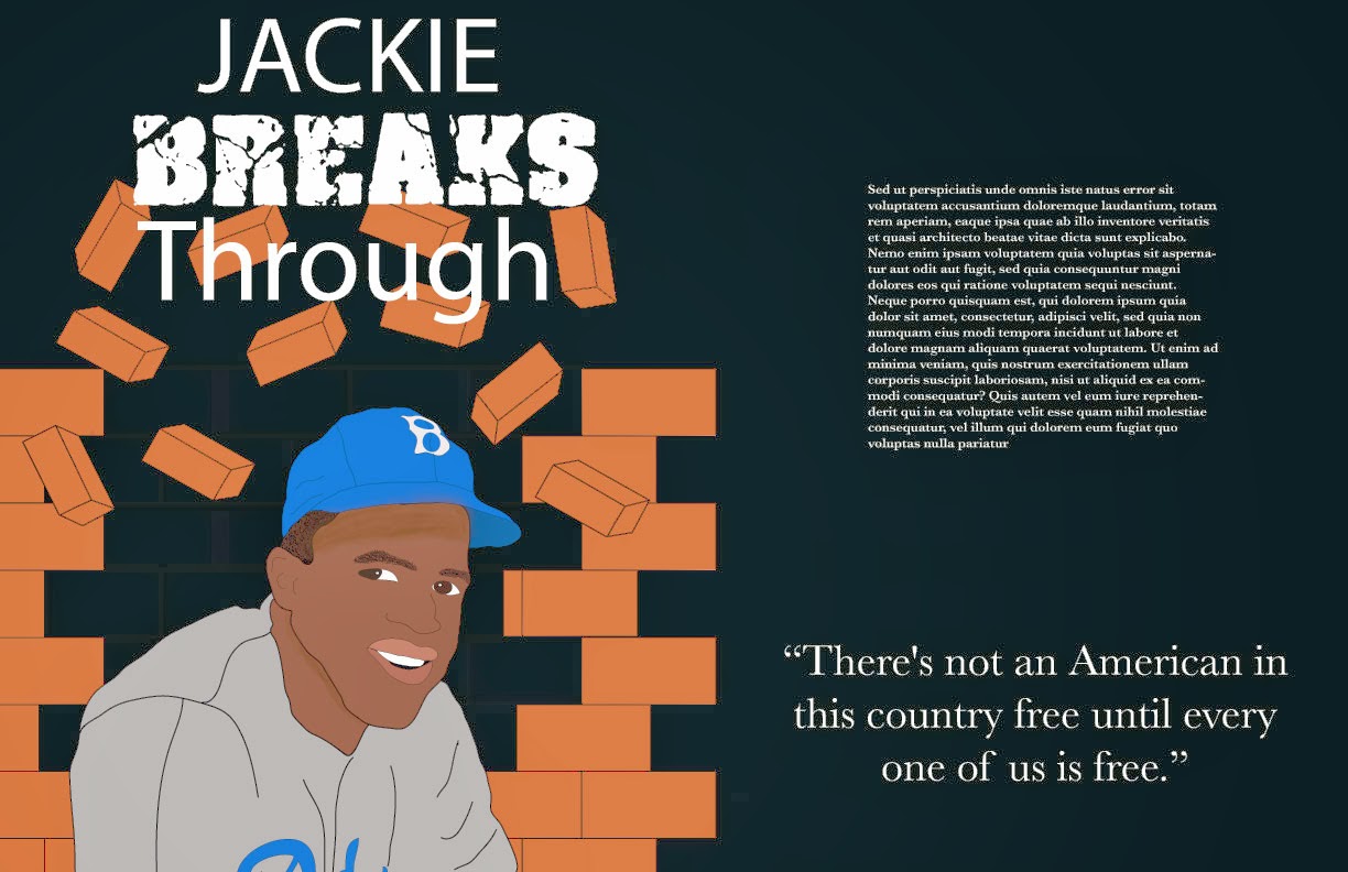
Here are the sketches I came up with based off the previous pictures I posted. I really like the bottom left one. The concept/style of this portrait will reflect on the fact that Jackie Robinson broke through the barriers of race in major league baseball years ago. There is a brick wall behind him (in the shape of the number 42) and it looks as though he is breaking through it. I would like the new pieces of brick (the ones not shaded in and not the ones flying through the air) to be Dodger blue. I chose brick because it's something very difficult to break, just as is was difficult for Jackie to break through the barriers of race. 


The final portrait will be based off of this sketch. 


Since my hand-drawn sketch looks ridiculous, I chose to trace the picture that inspired me. Haha. I want this portrait to look as realistic as possible with my own concept meaning behind it.

After tracing nearly every detail of the actual photo, I disabled that layer to see what it looked like...so here it is without the layer I traced!

Outline of the tracing. 


Then, it was time to add color! At this point, I had not added color to the jersey or traced the Dodgers on the front. 


Finally, after a LOT of steps, here is basically the finished product! I added the brick background in a new layer and added color to his jersey as well as traced the Dodgers logo on the front. I added shadows underneath his hat and near his jawline. I still have yet to figure out how to fade off the edges of the brick so it is not so blocky. I think with the headline "Jackie Breaks Through," this portrait definitely makes sense.