Sunday, April 13, 2014

RSU Police Poster


This was my first take on the poster. I wanted to incorporate their motto (Protection. Service. Education) but it just felt like there was something missing in the top left. 


So I brought the motto to the bottom and I think it looks better that way.


After class discussion, several suggestions were made. I stacked "Protecting the Hill" and removed the motto. Also, the claws were kind of hard to see so I took the image into Photoshop and filled them in to a solid color. And the last thing I did was change "Police Department" to "Campus Police." Since they are most often referred to as Campus Police, it makes more sense :)


Sunday, April 6, 2014

RSU Police Design Process

For this assignment, I looked up several police logos for an inspiration to re-create an RSU police logo. Whenever I think of a police logo, I think of a badge so that's what I'm going for for this logo.

This logo was retrieved from http://www.wsmr.army.mil/PAO/Pages/WhiteSandsMissileRangeClipart.aspx
I really like the shape of this badge. I definitely want to stay away from the star-shaped badge. It reminds me too much of a cartoon western or something. 


Here are my sketches based off the previous picture of the badge.


I definitely wanted to incorporate the Hillcat on the logo. Usually there is an eagle or something iconic featured on most badges so for the RSU one, the Hillcat will be featured. 

Here is my logo. The Hillcat was downloaded from http://www.rsu.edu/logos/athletics.asp. Unfortunately, it isn't a vector logo so when I choose to look at the finished logo in outlined form, the Hillcat disappears. I'll need to figure out how to convert it to a vector image. Of course the school colors are included. I used the pen tool to trace the shape of the badge and the ellipse tool to create the circles within the badge. I think it would especially look good as a patch on a uniform.


Here is the refined version of my logo.


And here it is in black and white!


After receiving suggestions, I came up with a few more designs. Although I still like my original concept, if I had to choose another design, it would probably be the new badge design. It's more simplified and to the point. I added the drop shadow instead of a color border because it simplified it a lot. 


Monday, March 31, 2014

Image Re-Creation

This was the image I chose to re-create. It was originally designed by Mike Sudal of The Wall Street Journal. This picture was found on google images and is pretty pixelated, but you get the idea of what it is. 


Here is my version of the illustration. I tried to use the eyedropper to accurately choose the original colors used, but since it was pixelated, the program had a hard time detecting the original color so I kind of had to eyeball it. Otherwise, I think it's pretty close. 

Sunday, March 23, 2014

Travel Poster Process

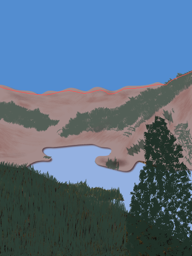
This was my final choice on the direction of my poster. Since the name of the town is Lake City, it's kind of mandatory to show a lake ;) 


I began by tracing the actual lake, which was the easiest part. The color is 40% of Pantone 285 C. 

Then I traced the mountains. After I traced the mountains, they looked boring so I started adding trees and shading to add something to them. I also noticed there wasn't really a distinct separation between the bottom of the mountains and the water, so I added a drop shadow to the mountains. Now it looks like there's a little bit of depth between the two. 
Then came the tricky part, the trees! It took me a while to find a brush that wasn't too blobby or jagged. I used a pretty simple brush for the pine trees, but I used a grunge brush for the large one in the foreground. I also wanted to distinguish the colors between the big tree and the background trees, so I multiplied the colors and made the foreground tree darker. The darker green is 100% Pantone 177-16 C and the lighter one is 75%. This screenshot also shows the added sky. I tried adding clouds, but nothing compared to the clouds in the original photo, they just looked fake and took away from what I was trying to convey in the picture. The color of the sky is 75% Pantone 285 C. 

And finally, I added the text. Lake City is written in a font called "Respective" retrieved from fontspace.com. Colorado is written in Baskerville. I like how the letters in Lake City overlap Colorado. This poster was pretty tricky, but it was a lot of fun getting to stare at my favorite place for a while :) can't wait to go back next year!


Monday, March 3, 2014

Travel Poster

My travel poster will be based off my favorite place in the world...Lake City, Colorado! This place is our annual family vacation spot. My concept will be based off these pictures (which I took myself in 2013 while we were on vacation). More than anything, I want to incorporate the scenery. But if I can, I'd like to include the friendly wildlife as well. 


Here are my stitches based on the pictures I posted. Each one accurately represents Lake City. I want to use block letters for the font because that is the type that is used on the sign when you drive into town. I'm excited to design something that supports such a beautiful place!


I took this picture last year in Lake City. I really like this type choice and would like to use it in my travel poster. The font is pretty just like the town! I believe it is "Respective" font from fontspace.com

I found this color palette on http://www.bkrdsn.com/alaska/ and I think it represents the colors used in the photos above. Specifically, I will be using the colors brown, green, and blue with different shades of each one.