
Here are the sketches I made for my layout. I found a layout on Pinterest that I really liked that actually had text inside a baseball. Since this layout is definitely baseball-related, I thought it was perfect for my concept. The headline for my layout is "Jackie Breaks Through" insinuating that he broke through the barriers of race in major league baseball years ago.

However, I had some issues with the baseball text. It's in the shape of a baseball, but it wouldn't let me apply an outer stroke to the shape. It would only apply it to the text, making it thicker and I didn't like that. Also, I couldn't figure out how to apply negative space within the baseball. I could use assistance on that :)
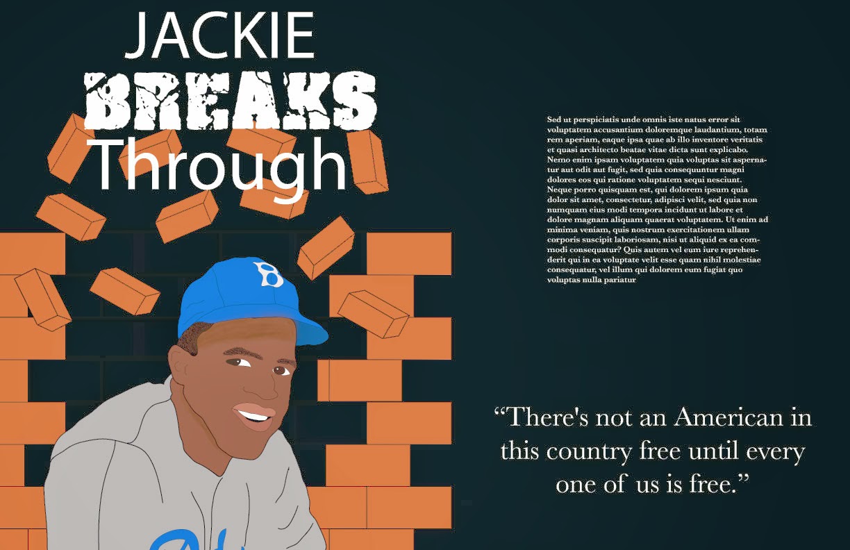
Here is the most I've gotten out of my layout. Since I couldn't figure out the stroke/negative space issue, I did it in block text. I also couldn't figure out how to fade off the bricks instead of them just stopping. I added the quote by Jackie Robinson because it relates to the freedom he achieved during his time as a professional baseball player. My typographical choices were pretty simple. I wanted a simple, classy text to surround the "broken" text to make it stand out. The simple text is in Baskerville and the word "BREAKS" is a font that I downloaded from fontspace.com called cracked and bold. Overall, I think it's pretty cool! This was a fun assignment.

After some great suggestions from the class discussion, here is the final layout! In the previous picture, you could still see the outline of the original bricks. So I removed those, added the #42 around the circle (implying a baseball-like text) and changed the color of the quote to make it pop a little more. Thanks for all the help! :)
No comments:
Post a Comment