Thursday, May 1, 2014

Re3Junk Final


Here is my latest refined logo. It's simple, easier to read on the lighter grey background (I didn't want the truck to be too dark and look like a UPS truck). I really like the knockout eyes, mouth, toes, and letters. It's amazing how far I've come since my first post on this assignment!


Here is the business card. I think it's simple, the most important information is at the top, and the logo is consistent. 

This is my truck design. Of course I didn't want to give up the slogan "We've got JUNK in the trunk." It is an attention getter (especially with the elephant's backside). Re3Junk on the front of the truck is easy to read. I definitely like the truck in the lighter grey instead of the dark grey. 


And here is the stationary. The logo is still consistent, but the grey had to be replaced with white knockout due to the stationary being white.

Here is my envelope. My logo was kind of hard to work with on an envelope because there are restrictions on print that bleeds off the paper. I think I made it work pretty good, but I'm still not entirely sure if it's "legal."


Here is the website. I have only designed one website before and it was completely different than this. It was challenging for me to fill up space since I don't have photos or anything. 


Sunday, April 20, 2014

Re3Junk

I have chosen to do the Re3Junk removal service.


Since a team of experts remove, recycle, and repurpose junk…a recycling theme is necessary.

 I like this recycling logo better. It is more modern and not the typical recycling logo. However, I would still like to make this logo stand apart from others even more, maybe by adding an globe-like look to it.


I like this elephant logo a lot! I was wondering if I turned it to the side if it would look like a the "3" in Re3Junk


I will probably use this truck as inspiration for my final design. 
When thinking of a slogan, I automatically think, "We've got junk in our trunk."
I think that slogan would set itself apart from competitors and create something that sticks in people's minds. 


This logo actually has a little recycling feel to it. I could probably put the actual recycling logo around the 24/7. Since it is a full time service - it needs to have that information within the logo. 


Here are my sketches based on my previous inspirations I posted. 


Word list:

truck
trash
garbage
hoarders
junk
24/7
cans
care
aluminum
bottles
boxes
workers
earth
environment
glass 
green
arrows
donate
repurpose
bin
litter
scrap
waste
clean
spring cleaning
rubbish
filth
service
salvage
save
load
filing cabinets
desks
paper shredders
computers
printers
cabinets
sinks
toilets
doors
files
chairs
washer
dryer
couches
beds
fridge
mattresses
stove
TVs
concrete
dirt
rocks
bricks
plaster
drywall
wood
freezers
a/c units
dishwashers
tables
hot tubs
pianos
motorcycles
bikes
 carpet
rugs


Here are the first-draft logos in both color and black and white. 


Here's what I have so far on my truck design. I chose something other than a "dump truck" because it needs to be differentiated from the city's garbage service. I like how the yellow pops out from the grey - I think it would definitely catch people's attention.
Also, I chose to use the elephant because they're strong and can lift things with their trunk. In addition, I think it fits the slogan: "We've got junk in the trunk"


The truck template that I downloaded didn't have a picture of the back, but when I find one, it'll look something like this. 


Here is one of the refined logos. I think this looks more realistic as well as easier to read. 


And here it is in black and white.


After a lot of thought and discussion, I simplified the logo even more. I added the knockout eyes, mouth, and stroke around the box. I also took out the lines on the trunk because they just weren't necessary. 


Tuesday, April 15, 2014

Branding

According to the Merriam-Webster dictionary, branding is defined as the promoting of a product or service by identifying it with a particular brand. 


Brand identity is fundamental to consumer recognition and symbolizes the brand's differentiation from competitors.


Some marketing experts have created logos/brands that are extremely familiar to us, enabling us to recognize them on a daily basis. Some examples include McDonald's, Nike, and Gibson guitars. 


One of the case studies I found regarding branding was the one dealing with Blackberry. I found this very interesting. 


Link: http://landor.com/#!/work/case-studies/blackberry/


This case study deals with Blackberry not "standing out enough." Moving into a new decade of technology, Blackberry had to make itself more relevant and needed more tools to help manage its identity. The final decision was to completely change the identity of the Blackberry. 


In result:

BlackBerry was named one of Landor’s Top 10 Breakaway Brands for 2007 by Fortune magazine.
BlackBerry was named one of the Best Brands of 2007 by BtoBmagazine.

Sunday, April 13, 2014

RSU Police Poster


This was my first take on the poster. I wanted to incorporate their motto (Protection. Service. Education) but it just felt like there was something missing in the top left. 


So I brought the motto to the bottom and I think it looks better that way.


After class discussion, several suggestions were made. I stacked "Protecting the Hill" and removed the motto. Also, the claws were kind of hard to see so I took the image into Photoshop and filled them in to a solid color. And the last thing I did was change "Police Department" to "Campus Police." Since they are most often referred to as Campus Police, it makes more sense :)


Sunday, April 6, 2014

RSU Police Design Process

For this assignment, I looked up several police logos for an inspiration to re-create an RSU police logo. Whenever I think of a police logo, I think of a badge so that's what I'm going for for this logo.

This logo was retrieved from http://www.wsmr.army.mil/PAO/Pages/WhiteSandsMissileRangeClipart.aspx
I really like the shape of this badge. I definitely want to stay away from the star-shaped badge. It reminds me too much of a cartoon western or something. 


Here are my sketches based off the previous picture of the badge.


I definitely wanted to incorporate the Hillcat on the logo. Usually there is an eagle or something iconic featured on most badges so for the RSU one, the Hillcat will be featured. 

Here is my logo. The Hillcat was downloaded from http://www.rsu.edu/logos/athletics.asp. Unfortunately, it isn't a vector logo so when I choose to look at the finished logo in outlined form, the Hillcat disappears. I'll need to figure out how to convert it to a vector image. Of course the school colors are included. I used the pen tool to trace the shape of the badge and the ellipse tool to create the circles within the badge. I think it would especially look good as a patch on a uniform.


Here is the refined version of my logo.


And here it is in black and white!


After receiving suggestions, I came up with a few more designs. Although I still like my original concept, if I had to choose another design, it would probably be the new badge design. It's more simplified and to the point. I added the drop shadow instead of a color border because it simplified it a lot. 


Monday, March 31, 2014

Image Re-Creation

This was the image I chose to re-create. It was originally designed by Mike Sudal of The Wall Street Journal. This picture was found on google images and is pretty pixelated, but you get the idea of what it is. 


Here is my version of the illustration. I tried to use the eyedropper to accurately choose the original colors used, but since it was pixelated, the program had a hard time detecting the original color so I kind of had to eyeball it. Otherwise, I think it's pretty close. 

Sunday, March 23, 2014

Travel Poster Process

This was my final choice on the direction of my poster. Since the name of the town is Lake City, it's kind of mandatory to show a lake ;) 


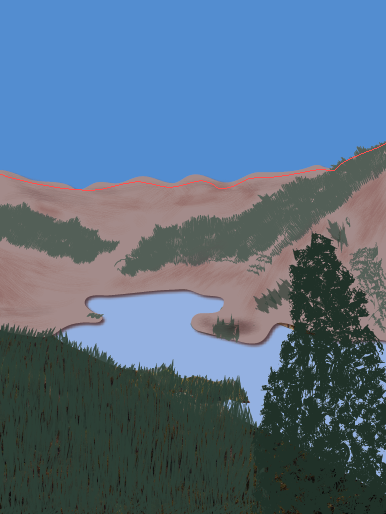
I began by tracing the actual lake, which was the easiest part. The color is 40% of Pantone 285 C. 

Then I traced the mountains. After I traced the mountains, they looked boring so I started adding trees and shading to add something to them. I also noticed there wasn't really a distinct separation between the bottom of the mountains and the water, so I added a drop shadow to the mountains. Now it looks like there's a little bit of depth between the two. 
Then came the tricky part, the trees! It took me a while to find a brush that wasn't too blobby or jagged. I used a pretty simple brush for the pine trees, but I used a grunge brush for the large one in the foreground. I also wanted to distinguish the colors between the big tree and the background trees, so I multiplied the colors and made the foreground tree darker. The darker green is 100% Pantone 177-16 C and the lighter one is 75%. This screenshot also shows the added sky. I tried adding clouds, but nothing compared to the clouds in the original photo, they just looked fake and took away from what I was trying to convey in the picture. The color of the sky is 75% Pantone 285 C. 


And finally, I added the text. Lake City is written in a font called "Respective" retrieved from fontspace.com. Colorado is written in Baskerville. I like how the letters in Lake City overlap Colorado. This poster was pretty tricky, but it was a lot of fun getting to stare at my favorite place for a while :) can't wait to go back next year!


Monday, March 3, 2014

Travel Poster

My travel poster will be based off my favorite place in the world...Lake City, Colorado! This place is our annual family vacation spot. My concept will be based off these pictures (which I took myself in 2013 while we were on vacation). More than anything, I want to incorporate the scenery. But if I can, I'd like to include the friendly wildlife as well. 


Here are my stitches based on the pictures I posted. Each one accurately represents Lake City. I want to use block letters for the font because that is the type that is used on the sign when you drive into town. I'm excited to design something that supports such a beautiful place!


I took this picture last year in Lake City. I really like this type choice and would like to use it in my travel poster. The font is pretty just like the town! I believe it is "Respective" font from fontspace.com

I found this color palette on http://www.bkrdsn.com/alaska/ and I think it represents the colors used in the photos above. Specifically, I will be using the colors brown, green, and blue with different shades of each one.